Blank Spaces
Activism through color app
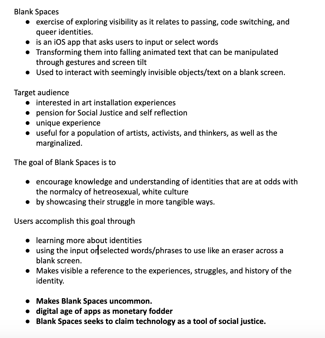
Blank Spaces is an iOS app that asks users to explore visibility and social justice by using contemporary terms to frame users to examine their own ideas surrounding these ideas. Users are asked to input their own phrase in relation to the term, and their letters then fall across the screen they’re manipulated through gestures to act as both eraser and paintbrush, revealing an image as they’re moved. Users are then asked to screenshot their final work as a way to capture their experience.
Timeline: November 26 2018 - December 7 2018
BIMD 351 Course
Medium: XCode + Adobe XD
Role: Project Manager
The Problem
In today's world, we have more information at our fingertips than ever before. However, reading information and allowing empathy to be built via information are two different things. When I was given a prompt of creating an app that had a social justice aspect, I knew I wanted to utilize a user experience as a means of helping develop empathy while still encouraging learning.
Inspiration
When I began to conceptualize my idea, I thought about how empathy is learned via discovery. When I contemplated what "Discovery" meant to me, I encouraged myself to reach into my personal influences. My first thought drifted to Merrit Kopas, a UW alumni and game designer who had created Lim, a browser game about navigating spaces as an "othered" minority. I then thought about Ergon Logos by Molleindustria, a text-based browser game that encouraged the play to use their movement as a means of reading a story. Both influences had powerful social justice ideals woven into their design, but what struck me the most was their use of movement as a means of revealing something more. This inspired me to think about how I could utilize gestures within an app to have the same effect.
The Proposal
As I thought about social justice and grappled with this idea of "discovery", I decided to think of marrying the swipe motion of a finger with the idea of this motion being used as an eraser that uncovered an image that related to social justice. I thought about a user catching a social justice term and using that term to uncover an image that related to the term's definition, and that the "erasing" effect could be likened to the "uncovering" or "discovery" of learning. I felt that the personal nature of erasing an image could help build empathy, and make this discovery more than just an exposed image. Thus, I created a pitch to be shared with fellow classmates. We would then vote on the pitches that we felt held the most promise, and be assigned into teams as a "hackathon" project.
Step 1
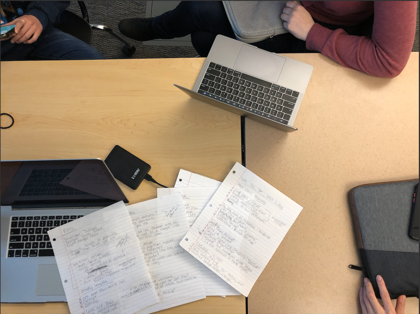
As a team, we planned out the project. We defined our goals given the assignment constraints, assigned roles, and created a plan on how to achieve our goals for the 2-week assignment. As the project manager, I made it clear that while I may have come up with the idea, I felt no ownership over it. This was a team assignment, and I wanted us to come together as a team to create something powerful. I believe setting up these types of expectations and open lines of communication allow for teams to come together more effectively. Furthermore, as the project manager, I created strict timelines and to-do lists of what should be accomplished daily. This allows us to hold each other accountable. With the planning out of the way, we could start into our design work.
Step 2
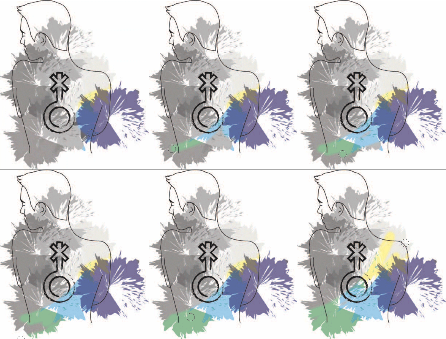
After our planning stage, we came together to discuss the user experience and UI of the app. I had had ideas and showcased them in the pitch, but felt that as long as the visual design supported the main design ideas, it could change to whatever was necessary. We spoke at length about what our core interaction of the app was, and how we were going to achieve this. We struggled with trying to find something that sparked some joy within the experience, as my pitch had centered around an educational and self-actualizing experience. Our core concept was an experience where someone could learn about social justice issues by utilizing a social justice term as an "eraser tool" and sliding their finger across the screen to uncover an image associated with the term. After the image was uncovered, they would be given the definition of the term. After discussions with our professor, we realized that instead of simply revealing an image, we needed to have the user felt involved in the creation of the image. In a moment of inspiration, our team was struck with the thought of making the "eraser tool" more of a "paintbrush". This would mean that the blank space would slowly be erased to reveal a colorful image underneath, giving the impression of a paintbrush being used. This created a more engaging user experience, and better supported our design concept and goals.
Step 3
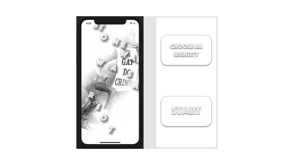
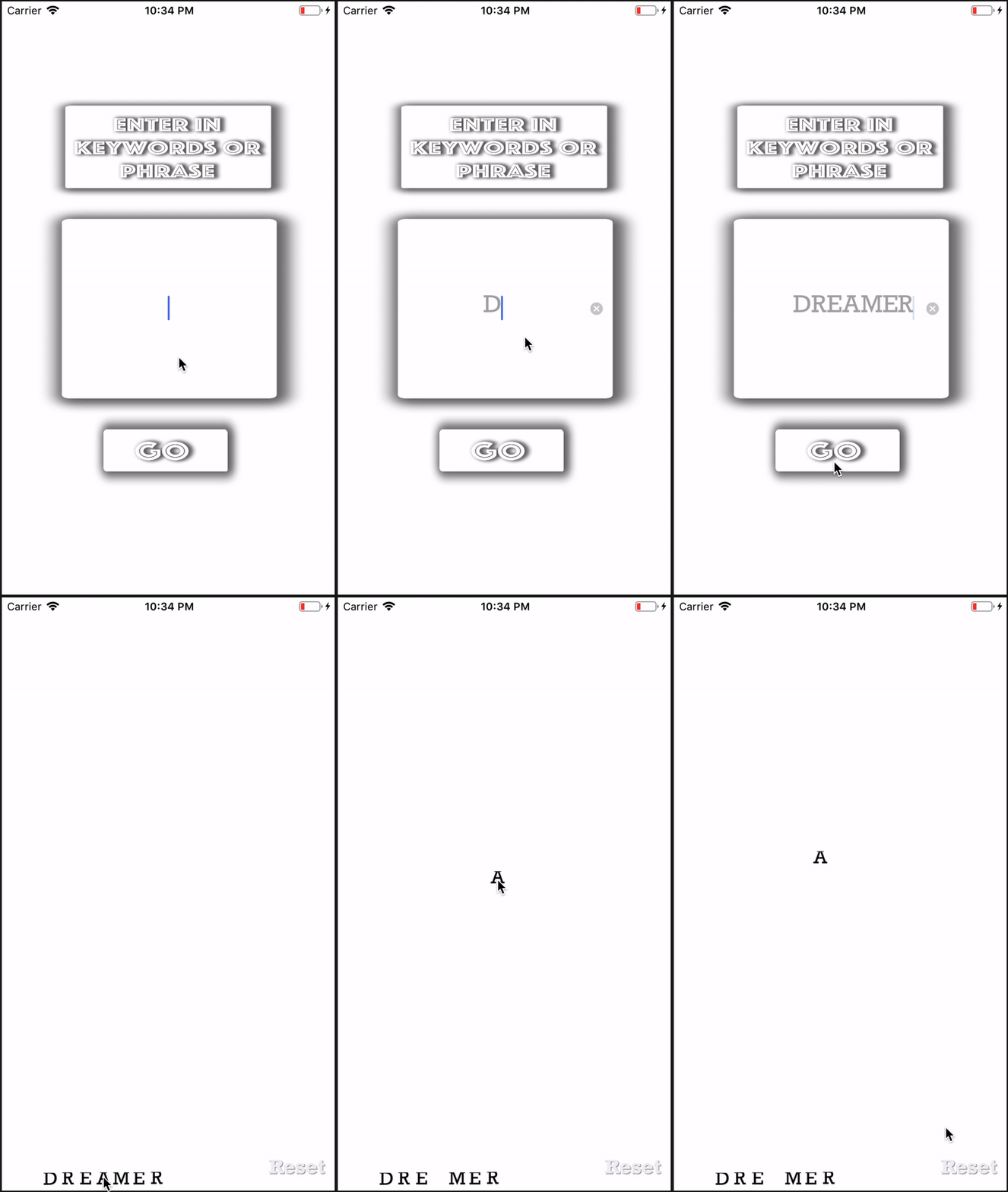
Now that we understood our concept, we needed to implement it! As a team, we spent time talking about how the swipe gesture would function within the experience. As seen in the above photo, we wanted to utilize the letters or words chosen by the user to "uncover" something about social justice. While we had a handle on the swiping gesture, it was up to us as a group and our Developer Juhyun to figure out how we were going to implement grabbing the words to "uncover" what was beneath. We spent time specifically researching the swipe gesture, and looking at code that had to do with manipulating points on a screen, or being able to drag items. Juhyun spent a significant amount of time speaking with other developers in class and with our professor, before being able to create the prototype seen to the left.
While very rough, this was the core interaction of our app. After a social justice term is entered into the screen or is chosen, the term is then dropped into the "Blank Space" of the app, where users are then able to manipulate it as an "eraser/paintbrush". Within our group, this was the first experience we had at "hacking code" (swipe gesture) to create a unique experience. While the time frame was short, we were satisfied at the end interaction and hack we were able to create and felt like it was a different take on social justice-oriented experiences.

Step 4
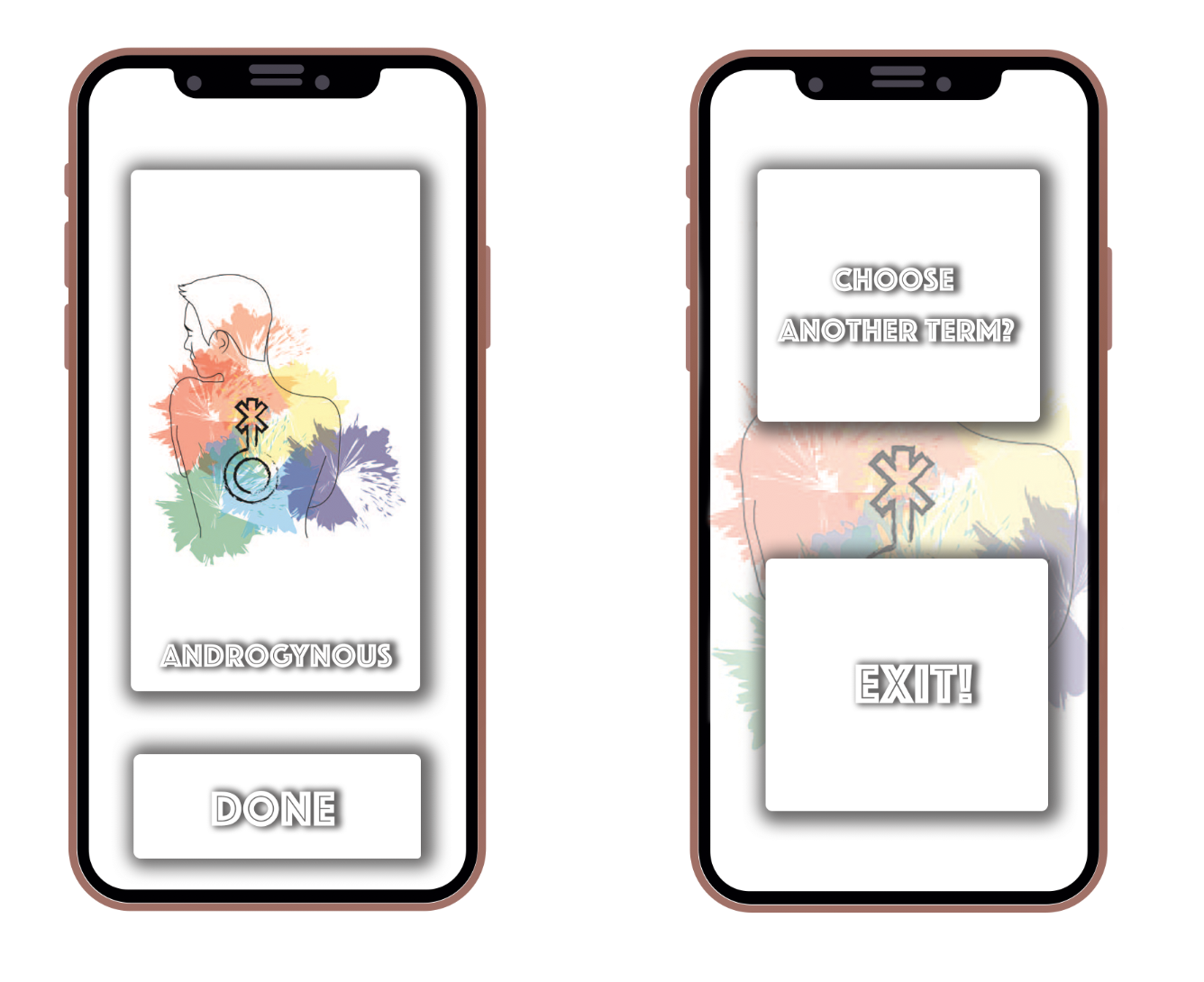
While the core interaction was being established via code, we also worked on a user flow and screen mockups. From the beginning, we knew we needed to have a pretty explicit user flow for 2 main types of users: someone who was experienced with the app and someone who was not. This was motivated by 2 different concepts: (1) during the pitch process, I had received feedback that this would be a difficult project because the concept was somewhat dense, and could be confusing if the flow was unyieldly and (2) we had begun to imagine what this would be like outside of an app, and possibly as an installation in a museum. By having a "tutorial" we built in an idea of how it could be explained both within the app concept and as a future installation.
Additionally, we took time to research social justice terms and ideate on the type of imagery we wanted to "color in". At first, we thought about pulling famous images, such as Obama's Hope Poster or "Be Gay Do Crime" a symbol of Queer Anarchy. However, a member of the team named Abbie is an exceptional artist, who agreed to make some images for our mockups. This allowed us to begin narrowing the scope of the mockups and prototype, forcing us to focus in on the core interaction, and not make extra art or screens. With the short turn around of the assignment, this constraint was helpful. As a project manager, I see constraints as a means for my team and I to evolve. We decided to focus in on queer/feminist terms as the group felt that they understood and could explain them the best. As an activist and white woman, it's important for me to decentralize myself as the position of "knower" when it comes to social justice. From the beginning, I wanted us to only use terms that we felt we could represent with empathy and dignity, and only terms that we as a diverse team of PoC and LGBTQIA+ felt comfortable exploring.

Step 5
The end product was a user experience that allowed us to explore complex social issues via simplistic interactions. That being said, the pay off of the simplistic interaction was great, and the overall core of the interaction was not lost in translation as we attempted to design. I was proud that I could lead a team through my brainchild, and that we were able to complete so much within a short time period. Going through this process of planning, and then a research/implement/prototype experience allowed us all to slowly unravel the human-centered design process, and begin to see what we needed to learn as designers.
We presented our prototype to our class and received lots of positive feedback. While the UI ended up being somewhat clunky and hard to read, it was a much easier fix than having an uninspiring interaction design.
Reflection
Pushing forward, if we were to have more time and resources to complete this project, we felt that it would transform into an installation experience with a Microsoft Kinect device. This would allow one to utilize their whole body to create swipe gestures against wide-open walls. Not only would this further transform the interaction design, but it would add layers of meaning to the social justice concepts with the work and allow the development of empathy to be done collaboratively via a museum environment.
For myself as a designer, this taught me to start establishing a process or at least beginning to identify a process within my work. Process is a vital part of design and as a designer and manager, I need to be able to showcase what I did and how I made decisions. Additionally, I felt like I learned that design is a tool, a means of creating change. I feel like previously I had imagined design as specifically meaning visual design, meaning that if I was unable to create beautiful graphics, I wasn't a designer. By going through this project, I realized that to be a designer you must be a thinker. While visual design is important and apart of the execution of many aspects of design, if one cannot be a creative thinker and problem solver, they're unable to engage with the core of the design discipline. To be a designer is to be a hybrid of creative and analytical practice and understand that design is a process one uses a tool to engage wicked problems with.
